Colors
The colour palette is accessible and derived from the government brand standards. There are three primary types of colour groups: layout, interactive, and status.
On this page
Layout
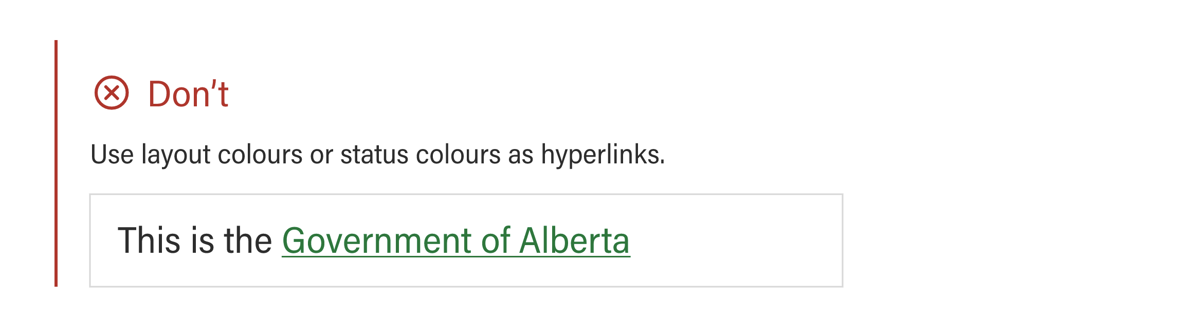
Grey and white should make up the majority of a website, with blue interspersed for contrast and visual interest. These layout colours are used for depth, hierarchy, and grouping.
Layout colours are derived from the GoA Corporate Identity colours.
| Colour | Colour name | Hex code | SCSS variable | Notes |
|---|---|---|---|---|
 | Primary-blue | #0081A2 | $primary-blue | Default brand colour. |
 | Dark-blue | #005072 | $dark-blue | Dark brand colour. |
 | Light-blue | #C8EEFA | $light-blue | Light brand colour. |
 | Black | #333333 | $black | Text colour. |
 | White | #FFFFFF | $white | Text on primary buttons, dark backgrounds. |

Accessibility
In accordance with WCAG 2.0 standards, in order to maintain a contrast ratio of 4.5 for all text sizes, the following rules apply:
- All of the dark and primary colour backgrounds are accessible with white text.
- All of the mid-tones and light colour backgrounds are accessible with dark text.

Interactive
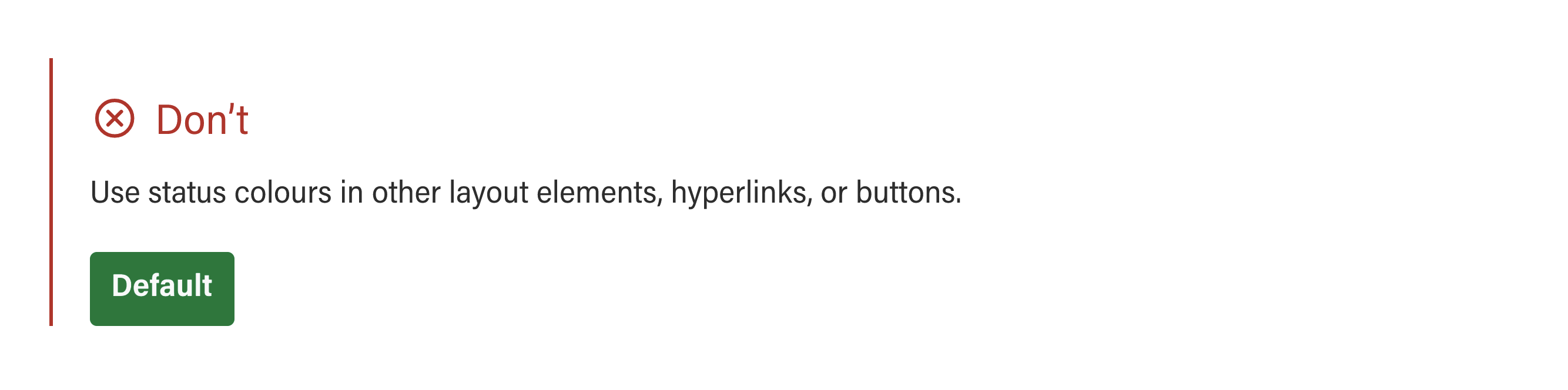
Interactive colours are solely used for hyperlinks such as links and button elements. In the event that a dark background is used, however, the hyperlinks will be white.
Interactive colours are derived from tints of Alberta Blue.
| Colour | Colour name | Hex code | SCSS variable | Notes |
|---|---|---|---|---|
 | Link | #0070C4 | $link | Buttons and unvisited links. |
 | Hover | #004F84 | $hover | Button and link hover state. |


Accessibility
Interactive colour text is accessible on white or light backgrounds In accordance with WCAG 2.0 standards, in order to maintain a contrast ratio of 4.5 for all text sizes.
Grey
| Colour | Colour name | Hex code | SCSS variable | Notes |
|---|---|---|---|---|
 | Dark-grey | #666666 | $dark-grey | Secondary text. |
 | Grey | #ADADAD | $grey | Grey. |
 | Mid-light-grey | #DCDCDC | $mid-light-grey | Borders. |
 | Light-grey | #F1F1F1 | $light-grey | Light background. |
Status
There are four status colours, these colours are used exclusively for alert or callout boxes. Status colours are derived from official Provincial and Flag colours.
| Colour | Colour name | Hex code | SCSS variable | Notes |
|---|---|---|---|---|
 | Status-info | #005DAA | $status-info | Information status. |
 | Status-success | #00853F | $status-success | Success status. |
 | Status-warning | #FEBA35 | $status-warning | Warning status. |
 | Status-emergency | #EC040B | $status-emergency | Emergency status. |

Accessibility
All text on status backgrounds with the exception of yellow must be white, in accordance with WCAG 2.0 standards, in order to maintain a contrast ratio of 4.5 for all text sizes.